


Your own website is basically your digital business card so you have to present it well in order to make it successful. According to Web Monkey Online, a well-designed website can help you a lot with increasing the website’s number of traffic and enhance its visibility. Therefore considering the requirement of the audience, you should set your goals and write down an actual action plan, which can help you distinguish your website from others. Below we pointed out 5 essential tips that can boost your website’s attraction.


Home Page
If you want to get the attention of the viewers, make sure you got yourself a killer home page. This is the first page people gonna see so take your time and design in really well. Don’t write a novel, use short paragraphs. People prefer to read less text but cut into pieces. Use bullet points! It can help you organize all the information effectively and makes it easy for the viewers to catch all the information quicker. While projecting your home page focus on the key factors and describe the benefits of the page. The clear and specific home page is the first step to success.
Content
If you want to capture the attention of clients you need to provide them with valuable content. Break up the text into smaller paragraphs so you don’t make the reader tired. Producing high-quality content keeps the clients engaged. Remember to do it regularly and do weekly updates. Make sure all the hyperlinks are working. Last but not least, keep your text consistent.
Images&Videos
Visualization always works better than text. It doesn’t mean you should bombard the readers with thousands of pictures. Providing valuable images and videos can encourage a lot of viewers to your website but there is always a need to have a limit. Quality over quantity!
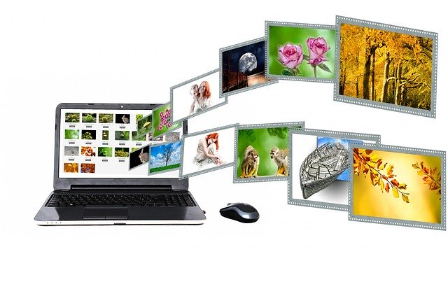

While picking images that match with your website, you should take into consideration that stock photos have less value. Nowadays people are pros in internet surfing, so make sure you don’t serve them images they could have already seen. More personalized media content always works better. Try to be unique, use your content wisely, and always make sure your images or videos are relevant to the content.
Keep Your Colors Balanced
This tip seems to be so obvious, right? Well, some people don’t know how essential it is to provide their audience with visible text which is easy to write. Here is what you can do in order not to overwhelm your clients.
Pair your colors well, make them contrast. Use eye-pleasing pastel background which gives you a bright and broad picture on your website. There is no need to distinguish your website by using intense colors. That can only give people nystagmus and seriously scare them away. Remember – black text on the white background is classy, not boring.
Call To Action
CTA is indeed a very important part of your webpage because it has the power to encourage people to do something, take the action. While making a CTA bottom, be creative! Poorly or wrongly written CTA can strongly impact your conversion. Call to action should attract the reader to follow you, so make sure to put a clear message on it, use eye-catching colours, fonts, and other visual elements. If you need inspiration, check the similar webpages. There is plenty of CTA examples everywhere, like “sign for free”, “Join us”, “get started” etc. Take the one that fits your style and refer to your content.

The Bottom Line
Designing your website doesn’t have to be commissioned to any of the special web designers. In fact, there are many things you can do yourself which can really help you bring people into your website and make it more user friendly for them. I do hope that the provided tips will give you some dose of inspiration for your webpage improvements.

