


If you're in the health and medicine niche, your personal branding or your company's branding might need a good website to emphasize your services and product offerings. However, this isn't just about making a fancy-looking website that will hook readers in with aesthetics. Website designs are also about practicality, features, and the compromise between fulfilling good user experience with a design that speaks about your brand's personality. However, just how should you approach your health website with these in mind?
It might help to look into a few statistics before starting up a website of your own. For instance, did you know that starting a website in itself is already a good thing for you and your goals? As much as 29 percent of America's small businesses actually have yet to make a professional website. This is bad for a lot of small businesses, given that 65 percent and 50 percent of website visitors actually look into a business' contact and About Us details, respectively. Not only that, but 95 percent of visitors actually say that a good user experience actually is a hallmark of a great website. In fact, companies can experience as much as a 200 percent to 400 percent increase in conversions with a good interface!
Starting A Health Website: The Steps To Follow

After taking the above into consideration, it helps to understand that building a niche-specific platform, such as a health website, can be tricky – not just because of its overall infrastructure. Rather, website design for niche-specific endeavors has a lot to do with finding the right compromise between your branding and what your audiences are looking for.
-
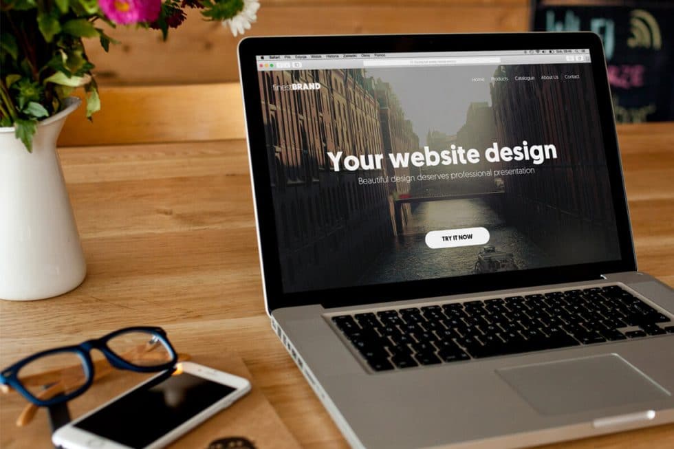
Always remember that visuals matter in your design
The maxim “a picture tells a thousand words” isn't something to take lightly, especially in website design. Remember that images and graphics can help emphasize and convey the real value of your content, can grab attention, and can visualize concepts otherwise difficult to explain. Given that a lot of people rely on sight and visuals, always think of the impressions your graphics will have on people. Main pictures should be on the homepage, product pictures should be highlighted, and images should always be high quality and integrated into your design seamlessly.
-
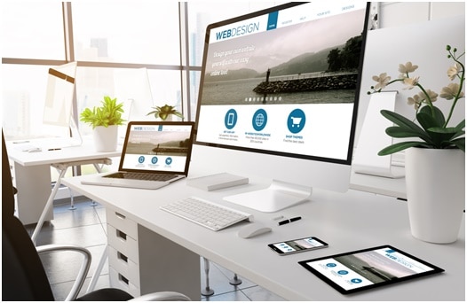
Responsive mobile design helps improve user experience
As said before, the user's experience is prioritized when it comes to making designs – as you're going to want users to stay there. This is emphasized more than ever when it comes to responsive mobile design, as you also have to take into account that users are also using multiple devices. With this in mind, you have to remember to design your website with a user experience built for both mobile and desktop experiences. When you add new elements to your site, make sure you constantly test it for mobile compatibility.


-
Interaction with your website matters
When it comes to providing a rich website experience, interactive website design – when done properly – can actually maximize the enjoyment and experience of the users who visit your website. This is important, especially when you realize you also have to make sure users get a good idea as to just how they can better interact with your site to maximize your services and content offerings. Try to have a site map at the ready, and make sure you design your site with your audience “journey” taken into serious consideration.
-
Make navigation a breeze for your users
Aside from interaction, make navigation a breeze for your visitors. Your interaction and navigation should be intuitive and simple so that your users won't have issues or be confused with what you're offering. For instance, your copy should be readable and tight, and your personality should be infused to your copy to make it easy to understand and simple to read. Make sure you can help users navigate much better by ensuring there are less than seven items in the main menu, all relevant information should be attained in just three clicks, and drop down menus should be avoided as much as possible.

-
Remember that white space is your friend
If you've ever dabbled into art, you've most likely heard of white space. Try to use white space in your layout, as it “balances” flavors you've used in your elements. You can use white space – which essentially can come in the form of even lighter shades of solid colors – to attract your users' attention and showcase elements you want them to see. This is important, as poor layouts and lack of white space will make sites overwhelming for users. A good practice in this regard is to at least practice spacing between segments and words for easier reading, and to lessen page elements to avoid confusion.
The Takeaway: Health Website Basics For Right Execution
If you want to make a health website to propel your personal or business branding, you've got to make sure it's got not just the aesthetics you need but the practical features it must have to service your clients. Remember, this health website will be the main gateway of audiences, readers, and potential patrons to be introduced to your service. As such, you should make it a point to make sure your website isn't just interesting, but that it's also accessible and built to enhance the user's experience as well.

